ShopDreamUp AI ArtDreamUp

Deviation Actions


Suggested Deviants


Suggested Collections


You Might Like…


Featured in Groups

Description
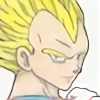
-Kayla-Hiwatari asked me to draw Azula and her OC, Zai, together and gave me permission to put them in any scene I felt like, so here's a fighting scene, for fun. I hope you like it! -Playlist: shuffle-
-Note: all art belongs to me unless otherwise stated, and may not be used without permission.
-*Azula and Avatar: The Last Airbender (c) Michael Dante Dimartino and Bryan Konietzko*
-*Zai (c) Kayla-Hiwatari*
-Pencil (2H, 4B), Pen (uni-ball), Blendy Stump
-Crayon: apricot, black, brick red, cerulean, denim, mauvelous, orange, red, timberwolf, and yellow.
-6 1/2 hours
Image size
2025x2193px 1.74 MB
© 2013 - 2024 Kaotic-Cass
Comments12
Join the community to add your comment. Already a deviant? Log In
Hey there! taaaaaaag, you're next on comment tag 
 My word was couple. I know these two aren't a "couple-couple" but they ARE a couple of people..... so .... it works! lol
First off, avataaaaaaaaaaarrrrrrrr!!! yaaay! Azula, one of the most underrated characters ever! she's CRAZAY MAN! I like how you depicted her, confident and bold. And the eyebrows, one lifted, that is the perfect sassy look for her! The perspective is really good too, the hand in the front is larger than the one in the back, and they both look to scale. Maybe the one in the front could have gone even bigger for a more distorted and obvious perspective! The other character looks pretty cool too! I would say maybe the waist is too small though? At least his right leg is, I think it should come out more, or there shouldn't be that little gap between his leg and Azula's light colored sleeve.
So yeah I really like the characters. It's the rest that kind of throws me off. Compositionally, I think the right side looks a bit heavy, as Zai takes up much more than Azula does on the left. You could have fixed this in lots of different ways! Like moving Azula over more to the left so both sides are in balance, or playing with the fire so it flares up more on the other side, etc. etc. Or the same thing with the white stuff, making it look more balanced.
Which brings me to my next thing.... what is that white stuff? It kind of looks like water, but I wonder why you didn't color it? When you pretty much colored everything else it looks a little odd. Of course the majority color scheme is red but I think the blue could add a nice extra dimension! It would draw out the blue in Zai's hair more, as well as create an interesting contrast between the elements. The characters would also SUPER pop, because then the upper space would be the only white area.
If all of that is clouds, then..... maybe why? lol, kind of interesting to put clouds on the bottom when usually they're on top. If they are clouds I would make them a little more disorganized and "independant" of one another. A good trick with clouds is letting the sky, or whatever, show through- less is more! And lots of variations of shading. When they are all stuck together in one mass you tend to get more of a rushing-river watery effect.
The fire- I think you could do better!!! Especially now that it is 2015 of course your skills have improved, but next time make it a little more chaotic. Even cartoon fire is kind of crazy! Same with all the coloring, having that black line separating the yellow from the orange is kind of jarring. Next time I would say just give it a gradation, or at least less of a hard line and more swooshy like your bottom textures.
Lastly, the border!! Kind of messy. It looks like you didn't really know how to end it... so.... lets just pen in some lines... yeah! lol. That's fine! But I would say either don't do it at all, or commit to it! Make it a really thick bold dark line, even in paint you can use the square tool and make a perfect square. Or, if you want it more loose like this style, I would say leave more of a white gap. commit to it! Again, you could open it in paint and just move it so you had more white showing all around. This way it would hearken to a kind of "digital matting"; most matting in frames is recommended to be 3 inches, which is kind of thick when it comes down to it! This is probably why my eye wishes there was more white space all around the whole piece.
O-K! lol there is my much longer than anticipated comment lol!!!! If you have any other questions please ask! Your next tagee is
  and your word is ADVENTURE!
My word was couple. I know these two aren't a "couple-couple" but they ARE a couple of people..... so .... it works! lolFirst off, avataaaaaaaaaaarrrrrrrr!!! yaaay!
So yeah I really like the characters. It's the rest that kind of throws me off. Compositionally, I think the right side looks a bit heavy, as Zai takes up much more than Azula does on the left. You could have fixed this in lots of different ways! Like moving Azula over more to the left so both sides are in balance, or playing with the fire so it flares up more on the other side, etc. etc. Or the same thing with the white stuff, making it look more balanced.
Which brings me to my next thing.... what is that white stuff? It kind of looks like water, but I wonder why you didn't color it? When you pretty much colored everything else it looks a little odd. Of course the majority color scheme is red but I think the blue could add a nice extra dimension! It would draw out the blue in Zai's hair more, as well as create an interesting contrast between the elements. The characters would also SUPER pop, because then the upper space would be the only white area.
If all of that is clouds, then..... maybe why? lol, kind of interesting to put clouds on the bottom when usually they're on top. If they are clouds I would make them a little more disorganized and "independant" of one another. A good trick with clouds is letting the sky, or whatever, show through- less is more! And lots of variations of shading. When they are all stuck together in one mass you tend to get more of a rushing-river watery effect.
The fire- I think you could do better!!! Especially now that it is 2015 of course your skills have improved, but next time make it a little more chaotic. Even cartoon fire is kind of crazy! Same with all the coloring, having that black line separating the yellow from the orange is kind of jarring. Next time I would say just give it a gradation, or at least less of a hard line and more swooshy like your bottom textures.
Lastly, the border!! Kind of messy. It looks like you didn't really know how to end it... so.... lets just pen in some lines... yeah! lol. That's fine! But I would say either don't do it at all, or commit to it! Make it a really thick bold dark line, even in paint you can use the square tool and make a perfect square. Or, if you want it more loose like this style, I would say leave more of a white gap. commit to it! Again, you could open it in paint and just move it so you had more white showing all around. This way it would hearken to a kind of "digital matting"; most matting in frames is recommended to be 3 inches, which is kind of thick when it comes down to it! This is probably why my eye wishes there was more white space all around the whole piece.
O-K! lol there is my much longer than anticipated comment lol!!!! If you have any other questions please ask!
and your word is ADVENTURE!