ShopDreamUp AI ArtDreamUp

Deviation Actions


Suggested Deviants


Suggested Collections


Description
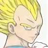
- Inktober / Drawlloween
- Fan Art: Black Cat (Felicia Hardy)
- This was an interesting challenge to work on, and I based this image on a cosplayer's photo. (I would have asked her permission to use the pose and all, but I had no way to get a hold of her, so...) I did like drawing this one though, It's interesting using the different pressures with the inks.
As always: thoughts, comments, critiques, favs, and watches are all appreciated! - Note: all art belongs to me unless otherwise stated, and may not be used without my express permission.
- *Black Cat (Felicia Hardy) (c) Marv Wolfman and Keith Pollard*
- Materials: inks.
:origin()/pre13/75db/th/pre/i/2015/303/9/a/_2015_inktober__15___i_came__i_chainsaw__i_conquer_by_kaotic_cass-d9exdgi.jpg)
:origin()/pre06/5bf9/th/pre/i/2015/287/1/d/_2015__inktober__12___magic_mystery__wip__by_kaotic_cass-d9d3hnw.jpg)
:origin()/pre13/cc64/th/pre/i/2015/282/c/e/_2015__inktober__8___urban_legends_by_kaotic_cass-d9ch3ab.jpg)
:origin()/pre15/0418/th/pre/i/2015/281/e/1/_2015__inktober__5___mutant_mayhem_by_kaotic_cass-d9c60lw.jpg)
:origin()/pre09/47fe/th/pre/i/2015/281/d/4/_2015__inktober__4___mansions_and_manors_by_kaotic_cass-d9c0gu1.jpg)
:origin()/pre01/1e17/th/pre/i/2015/208/9/5/garcia_by_kaotic_cass-d9341s3.jpg)
Image size
2480x3216px 582.71 KB
© 2015 - 2024 Kaotic-Cass
Comments2
Join the community to add your comment. Already a deviant? Log In

Your devotion to lifelike paintings with colour pencils and ink is awe-inspiring. While this piece may not be coloured, it has a few features shared across your other works.
Once again, perspective seems to be an issue on the micro level, such as at the nose and lips, something that is quite hard to accomplish. Because we see faces every day, small oddities or differences are more visible. I'm sure that you could have done better with pencils instead of ink, but it's an Inktober challenge, so there's that. The nose could use some - but not too much - more lining to make it stand out more, such as here, and straighter, of course.
Granted this was done last year, but I have to point out its flaws regarding perspective and torso proportions. Her bust doesn't follow the same invisible projection lines as her arms and shoulders, which throws off the piece's symmetry.
However, this piece's eyes have an angle to them that complements their direction away from the viewer. That is something that I will praise whenever it comes up, because it's actually harder on the eyes than the nose and mouth. Since you got the eyes down, I think you'll do well applying it on the nose and lips too.
Unrelated: I like your manga-style drawings a lot, actually. They follow the same basic principles as realistic styles regarding perspective and foreshortening, and the same lessons that you've mastered with them will also apply, to some extent, to portraits.
Thus ends this round of Comment Tag (finally). Good luck.